Introduction
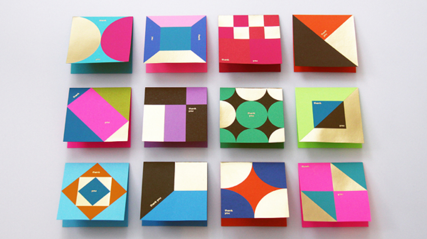
A well-crafted design requires more than just a creative eye; understanding the principles and psychology of color is crucial. Color theory plays a pivotal role in perceptual experiences, conveying mood, evoking emotions and communicating messages. In the field of design, it is not just about selecting vibrant shades; it revolves around choosing the right color scheme to initiate desired responses. Grasping color theory can enhance design aesthetics significantly. In this article, we will delve into the top tips about color theory to help you take your design skills to the next level.
Comprehend The Color Wheel
A foundational step towards mastering color theory is understanding the color wheel. It’s a circular diagram representing colors and their relationships. Here, colors are segregated into primary, secondary, and tertiary. Primary colors are blue, red, and yellow. Secondary colors, commonly referred to as green, orange, and violet, are generated by mixing primary colors. By mixing a primary and a secondary color, you get tertiary colors.
Learn About Color Harmony
Color harmony forms the backbone of color theory, ensuring that the colors incorporated in the design coexist harmoniously. When colors create a balanced and visually appealing scheme, you have achieved harmony. A few common techniques include monochromatic, analogous, complementary, and triadic schemes. Each of these methods involves a different way of picking colors from the color wheel, inducing different visual emotions.
Understand The Color Context
According to the context, the perceived color can change significantly. This concept is profoundly related to understanding how colors influence each other and depend on the surroundings. Contrasting colors make each other pop, while analogous colors are often used for nuanced shifts in a design.
Get Acquainted with Color Psychology
Accurate understanding and application of color psychology can result in effective communication with the audience. Human brain perceives colors differently, associating each one with particular feelings or emotions. Therefore, colors can affect one’s mood and decision-making ability. For example, using red color in a design can evoke a sense of urgency or alertness. On the other hand, blue is often associated with trust and reliability.
Experiment with Color Values
Playing around with color values can change the entire perspective of a design, adding depth to it. This includes adjusting the lightness/heaviness (value), intensity (saturation), and the actual color (hue). Understanding these aspects will allow for versatility in your designs, from creating contrast to making particular components stand out.
Embrace The Power Of Neutrals
Neutral colors are often underestimated, but designers recognize their power. Colors like black, white, grey, and beige can powerfully define a design. They provide visual relief, separate colors, and highlight important components. They provide balance against the intense colors, providing a minimalistic yet chic look.
Use Tools And Resources
Numerous online tools and resources can simplify the process of color selection, offering pre-made color schemes. Some popular applications include Adobe Color, Coolors, and Color Hunt. These tools also give you the ability to experiment with different palettes and understand how colors interact.
Conclusion
Mastering color theory is instrumental in enhancing your ability as a designer. It’s not simply about choosing attractive shades. It’s about understanding the meaning behind colors, their harmonious relationships, their psychological effects, and their values. With the right balance of experimentation and understanding, color theory can become a strong tool in your design arsenal. The advice covered in this article can be your stepping stone to effectively harness the power of color and its potential impact on your designs.